Case Study
Enterprise Component Library
UX Design
Design Systems
Component Architecture
Component Library
Technical Prototyping
The product is a complex, enterprise-level internal no-code platform that allows users to build custom application pages. The product team needed a comprehensive, technically accurate Figma Component Library that bridges the gap between the global design system and the live product's constraints, ensuring all future prototypes are 100% feasible and development-ready.
Year
2025
Team
Main Designer (in collaboration with a UX peer for QA and Frontend Developers)
Scope
UX Design
Design System Architecture
Advanced Figma Prototyping
Cross-functional QA
Software
Figma (Auto-layout, Variables, Variants)
Challenges Identified
01
Global system disconnect
The standard corporate design system didn't cover the unique features of our specific builder platform
02
Prototyping friction
Designers and users couldn't accurately prototype because existing components lacked realistic platform properties
03
Technical inconsistencies
A disconnect between design mockups and actual platform capabilities slowed down developers
Project Goal
Build a dedicated, 1:1 Figma component library for an enterprise no-code web-builder to bridge the design-to-development gap
User Groups
Based on internal workflows, technical requirements, and the needs of the product team
01
UX/UI Designers
For rapid, accurate prototyping
02
Frontend Developers
For seamless technical handoff
03
End-Users
For aligning features and expectations
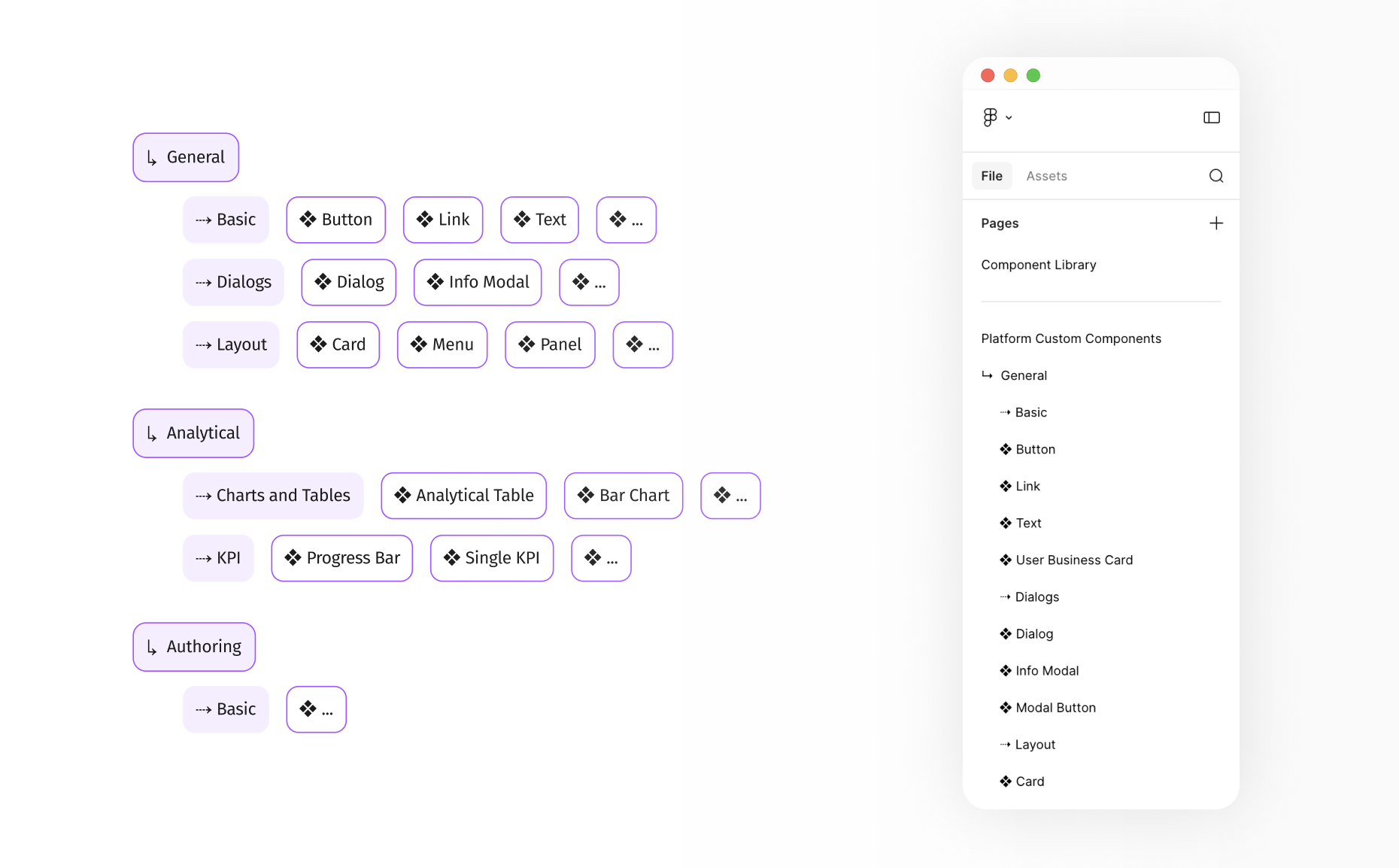
Component Architecture & Taxonomy
To ensure logical navigation within the Figma assets panel, the library was structured systematically, mirroring the live platform's categories
→
General (Basic, Dialogs, Layout)
→
Analytical (Charts and Tables, KPI)
→
Authoring (Forms)
Taxonomy Overview
Key Steps
→
Reverse-engineering the live platform to map out every single configurable property for each element
→
Utilizing Auto-layout, Variants, and Variables to perfectly mimic real platform settings (e.g., size, style, state)
→
Integrating smaller UI elements into complex modules (Charts, Modals, Tables) for easy maintenance
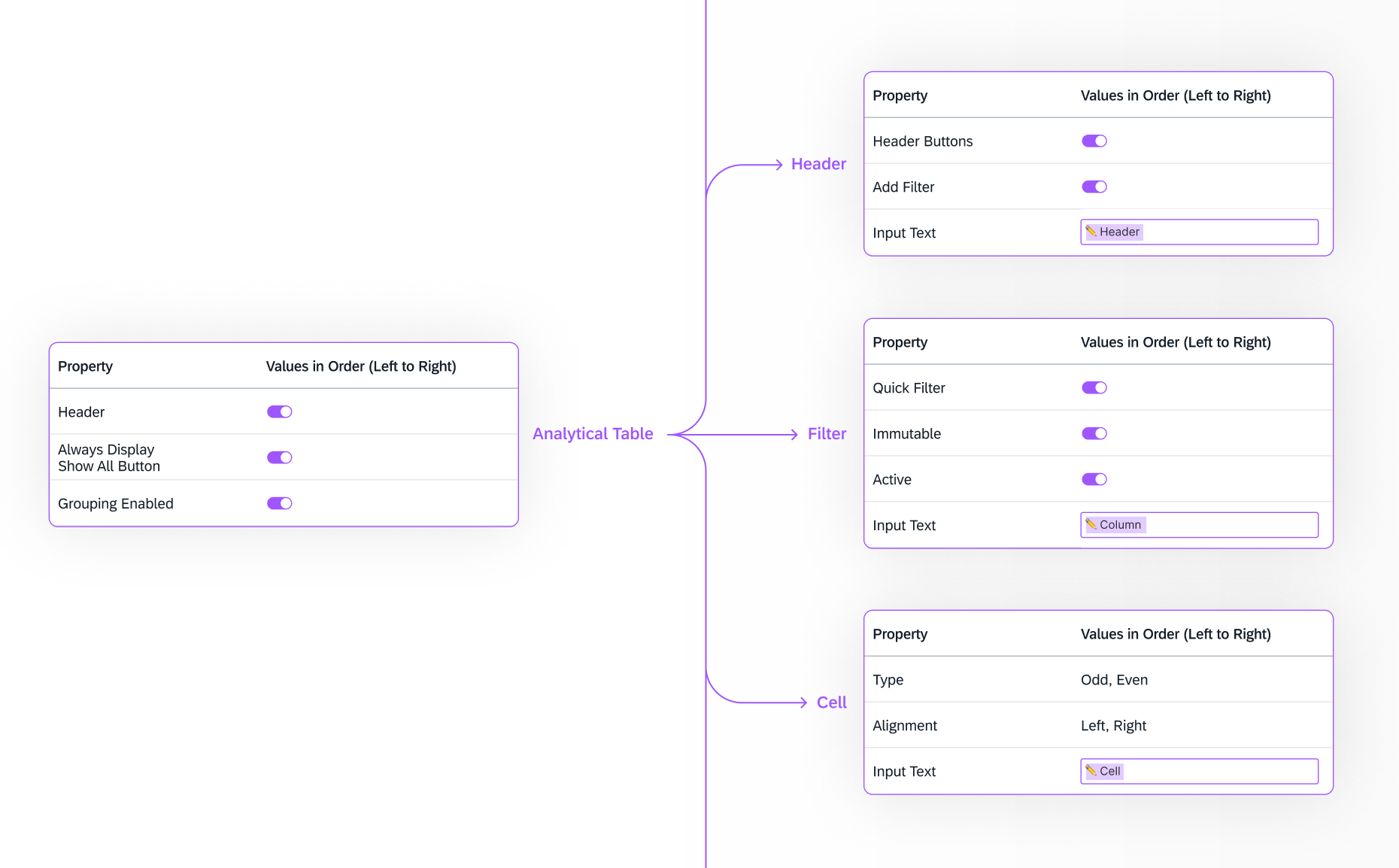
Deep Dive: Complex Components
The Analytical Table was the most complex component, requiring dozens of potential configurations (grouping, filtering, sorting). My goal was to create a Figma component that felt exactly like the live platform.
Component Anatomy & Nesting Strategy
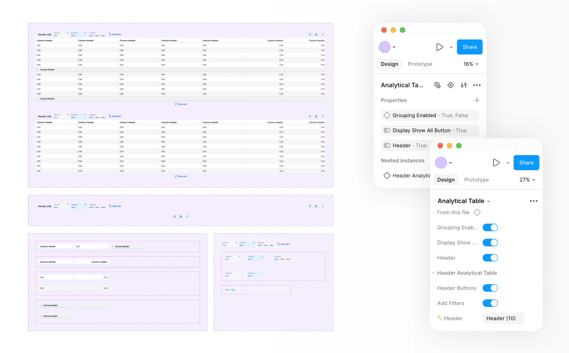
Property Mapping & Nested Instances
Every configurable property was mapped, ensuring that the sequencing of settings in the Figma sidebar perfectly mirrored the live platform’s UI. This was achieved by implementing a "component-in-component" (deeply nested) architecture. Granular "atomic" cells and header types were built first and then assembled into flexible tables. This approach ensured scalability and allowed for complex states without breaking the Auto-layout.
Pre-build Nesting Logic
Testing & QA
→
Validating Figma component properties against live platform code
→
Testing Auto-layout for responsive resizing
→
Verifying logic in nested components
→
Cross-functional QA with frontend developers
Impact & Results
→
Fully functioning Component Library tailored to our product's architecture
→
Bridged the gap between design and development
→
Significantly reducing prototyping time


Let’s discuss how my experience aligns with your team’s needs


Case Study
Enterprise Component Library
UX Design
Design Systems
Component Architecture
Component Library
Technical Prototyping
The product is a complex, enterprise-level internal no-code platform that allows users to build custom application pages. The product team needed a comprehensive, technically accurate Figma Component Library that bridges the gap between the global design system and the live product's constraints, ensuring all future prototypes are 100% feasible and development-ready.
Year
2025
Team
Main Designer (in collaboration with a UX peer for QA and Frontend Developers)
Scope
UX Design
Design System Architecture
Advanced Figma Prototyping
Cross-functional QA
Software
Figma (Auto-layout, Variables, Variants)
Challenges Identified
01
Global system disconnect
The standard corporate design system didn't cover the unique features of our specific builder platform
02
Prototyping friction
Designers and users couldn't accurately prototype because existing components lacked realistic platform properties
03
Technical inconsistencies
A disconnect between design mockups and actual platform capabilities slowed down developers
Project Goal
Build a dedicated, 1:1 Figma component library for an enterprise no-code web-builder to bridge the design-to-development gap
User Groups
Based on internal workflows, technical requirements, and the needs of the product team
01
UX/UI Designers
For rapid, accurate prototyping
02
Frontend Developers
For seamless technical handoff
03
End-Users
For aligning features and expectations
Component Architecture & Taxonomy
To ensure logical navigation within the Figma assets panel, the library was structured systematically, mirroring the live platform's categories
→
General (Basic, Dialogs, Layout)
→
Analytical (Charts and Tables, KPI)
→
Authoring (Forms)
Taxonomy Overview
Key Steps
→
Reverse-engineering the live platform to map out every single configurable property for each element
→
Utilizing Auto-layout, Variants, and Variables to perfectly mimic real platform settings (e.g., size, style, state)
→
Integrating smaller UI elements into complex modules (Charts, Modals, Tables) for easy maintenance
Deep Dive: Complex Components
The Analytical Table was the most complex component, requiring dozens of potential configurations (grouping, filtering, sorting). My goal was to create a Figma component that felt exactly like the live platform.
Component Anatomy & Nesting Strategy
Property Mapping & Nested Instances
Every configurable property was mapped, ensuring that the sequencing of settings in the Figma sidebar perfectly mirrored the live platform’s UI. This was achieved by implementing a "component-in-component" (deeply nested) architecture. Granular "atomic" cells and header types were built first and then assembled into flexible tables. This approach ensured scalability and allowed for complex states without breaking the Auto-layout.
Pre-build Nesting Logic
Testing & QA
→
Validating Figma component properties against live platform code
→
Testing Auto-layout for responsive resizing
→
Verifying logic in nested components
→
Cross-functional QA with frontend developers
Results & Impact
→
Fully functioning Component Library tailored to our product's architecture
→
Bridged the gap between design and development
→
Significantly reducing prototyping time


Let’s discuss how my experience aligns with your team’s needs
