Case Study
Erasmus+ Youth Academy
UX Design
UI Design
Interaction Design
Website Implementation (Webbuilder)
Brand Design
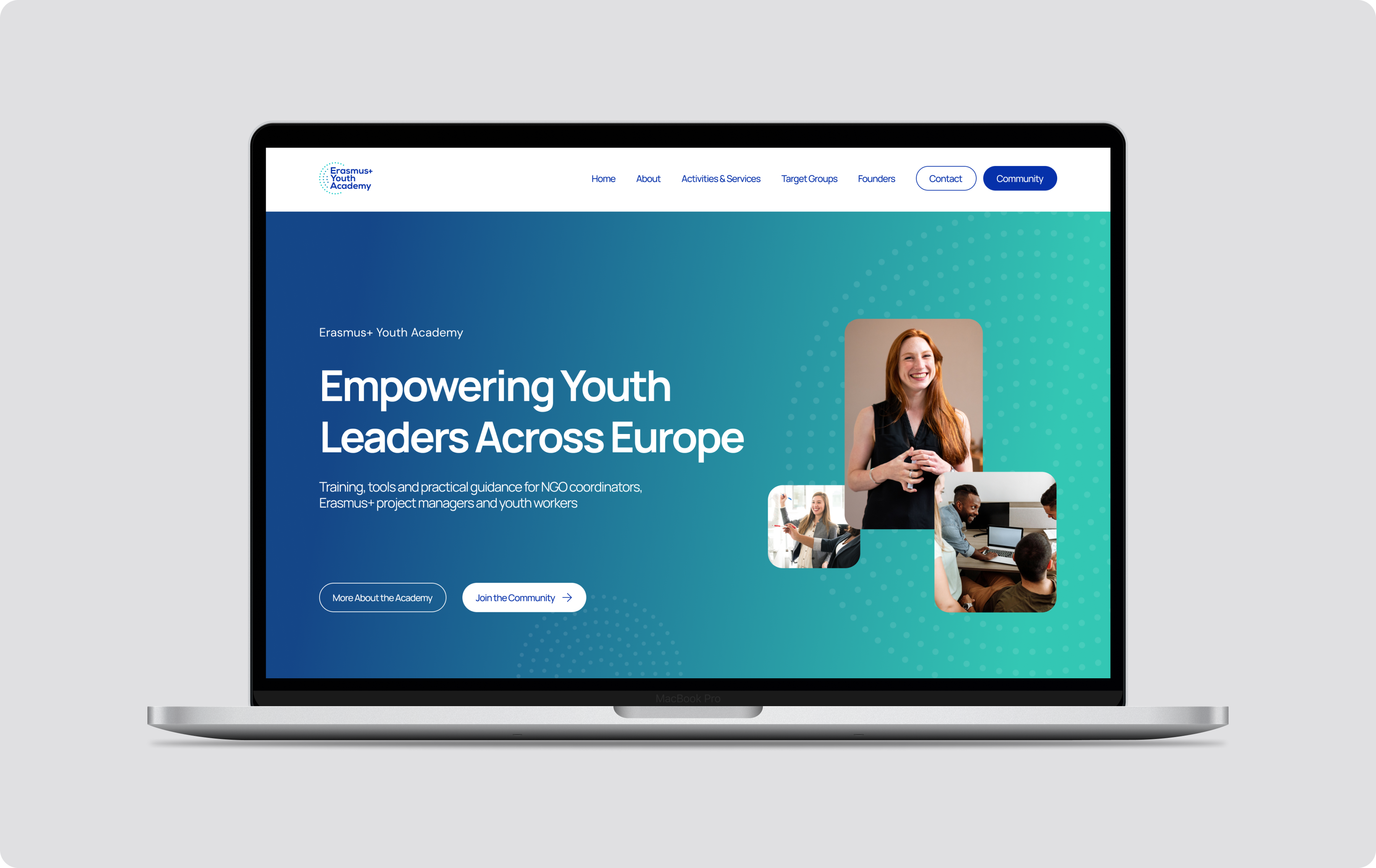
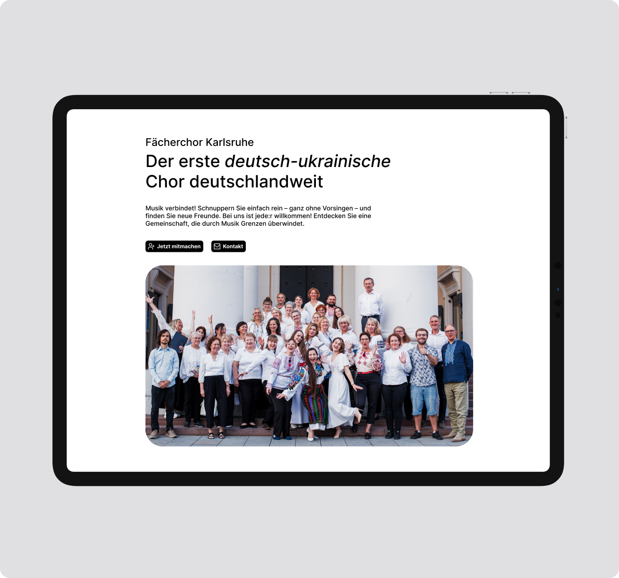
The Erasmus+ Youth Academy is an international educational initiative supporting NGO leaders, project managers, and youth workers involved in Erasmus+ and European Solidarity Corps programmes.The organization needed a modern, trustworthy, youth-oriented website that communicates clarity and professionalism while appealing to a young, international audience.
Year
2021-2022
Team
Solo designer
Scope
UX/UI DesignWebsite ImplementationInteraction DesignVisual Identity
Software
Miro
Adobe Illustrator
Adobe Photoshop
Adobe After Effects
Figma
Tilda Website Builder
Challenges Identified
01
No existing brand identity
The organization was new and had no visual language, logo, or design system
02
Need for clarity, trust, and motivation
Users should instantly understand the purpose and feel invited to join
03
Limited technical resources
The website needed to be built using Webbuilder, so designs had to work within constraints
Project Goal
Create and build a fully responsive website with interactions for a young audience
User Groups
Based on client workshops, discovery discussions, and an analysis of their existing target audience
01
NGO coordinators
Looking for tools, training, and application support.
02
Project managers
Need structured, reliable information and resources
03
Young trainers & youth workers
Prefer a simple, inspiring tone and visuals
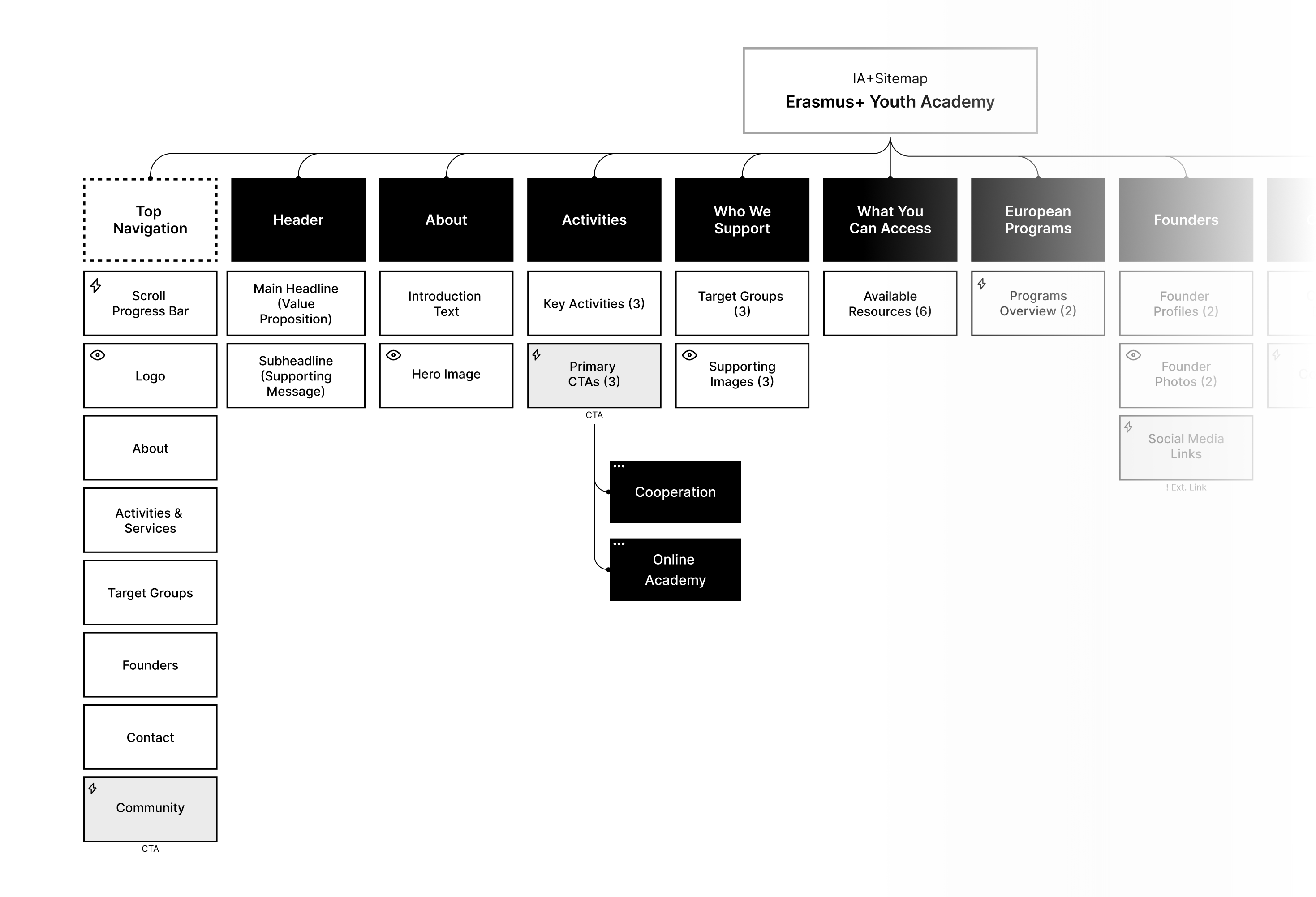
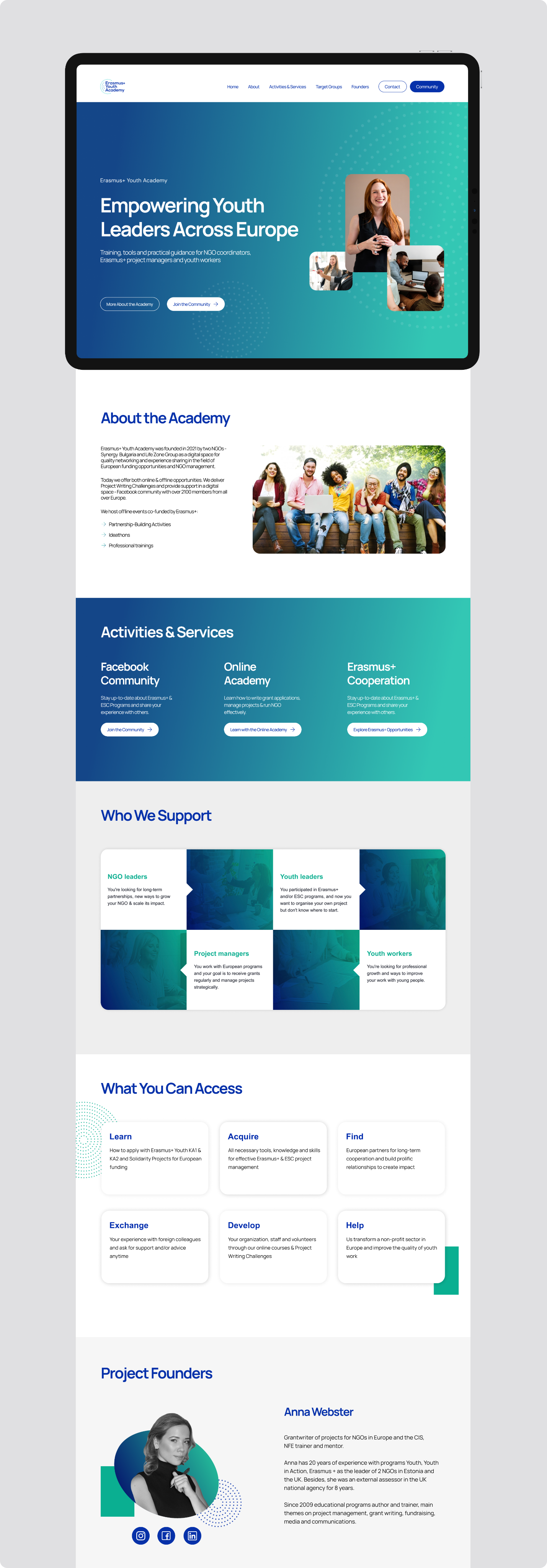
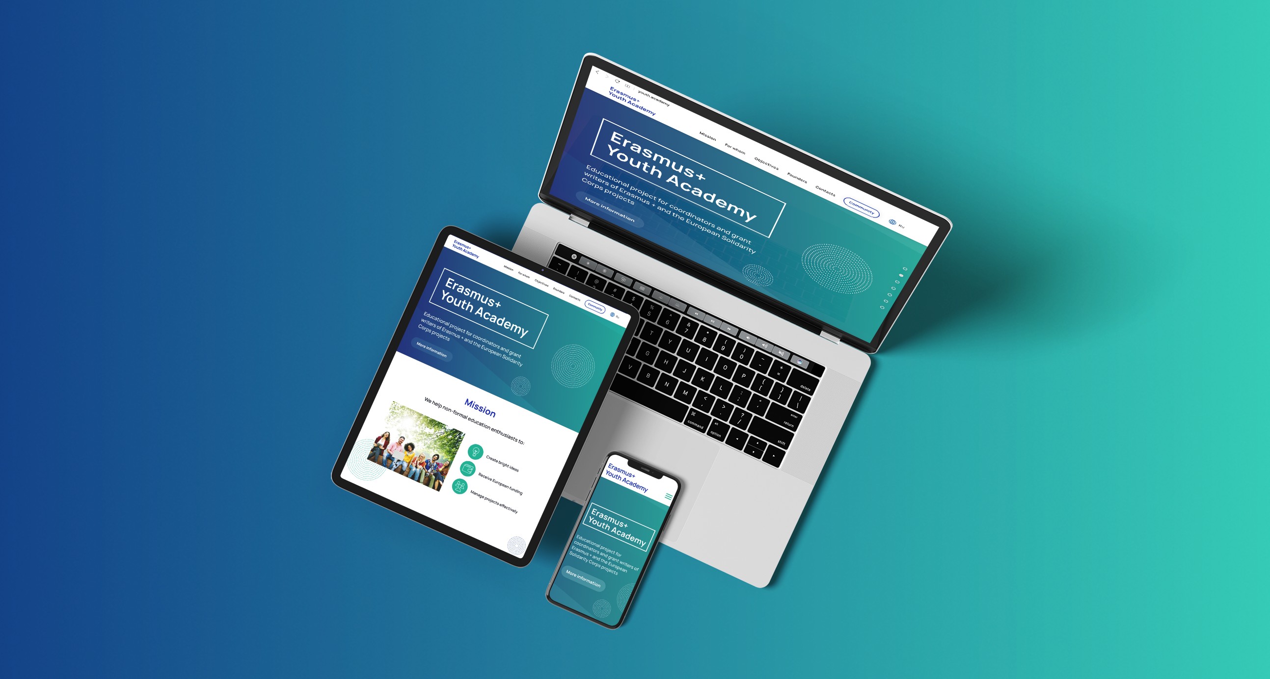
Information Architecture
To minimize cognitive load for first-time visitors, the top-navigation was structured to be simple and focused
→
Home
→
About
→
Activities & Services
→
Target Groups
→
Founders
→
Contact
→
CTA
IA & Sitemap
UX Priorities
Scannability
Keep the homepage under 1 min scroll time
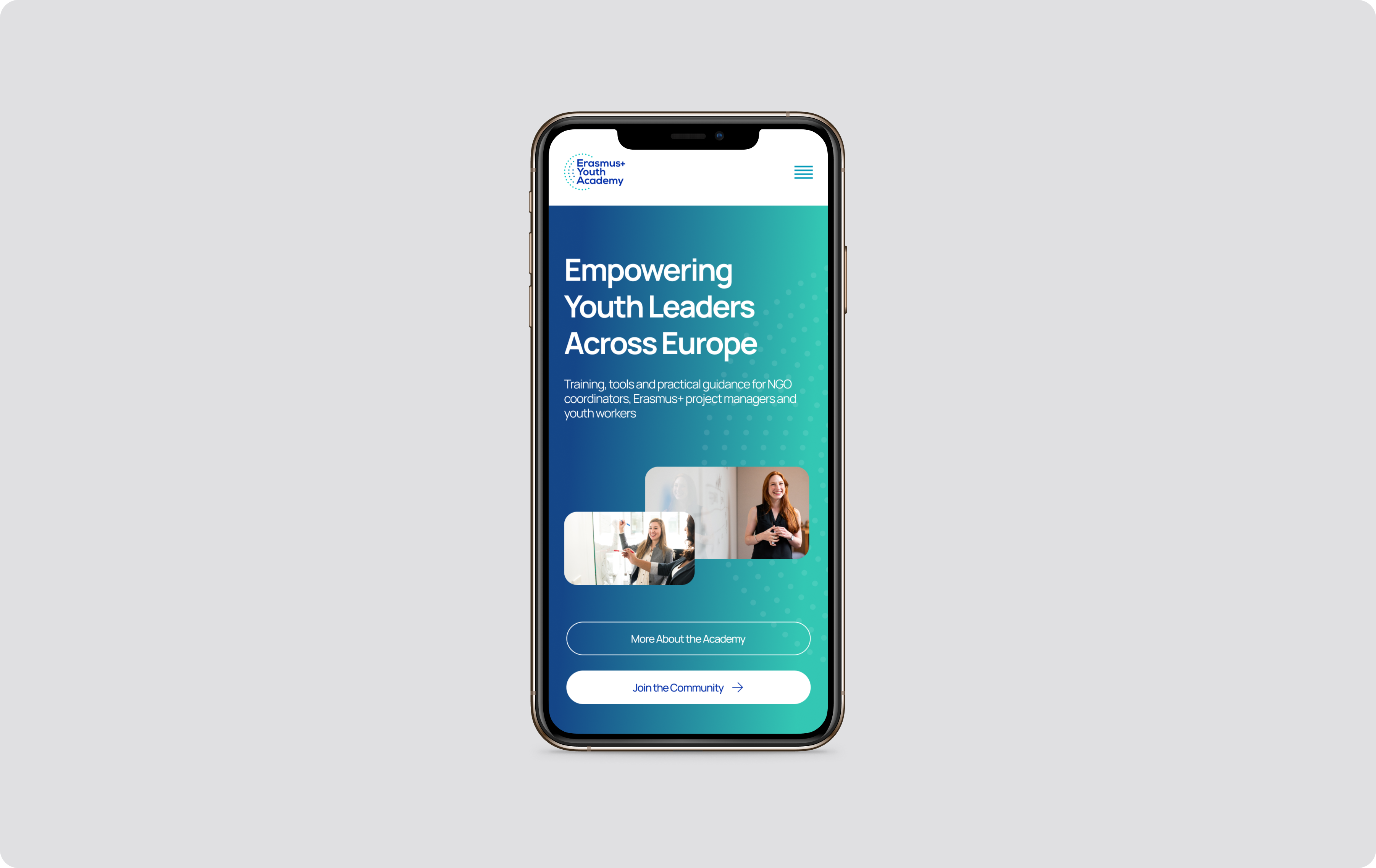
Mobile-First Design
Prioritizing layouts and interactions for mobile devices
Accessible Language
Ensure readability for non-native English speakers
Low-Fidelity Wireframes
Header & Hero Sections
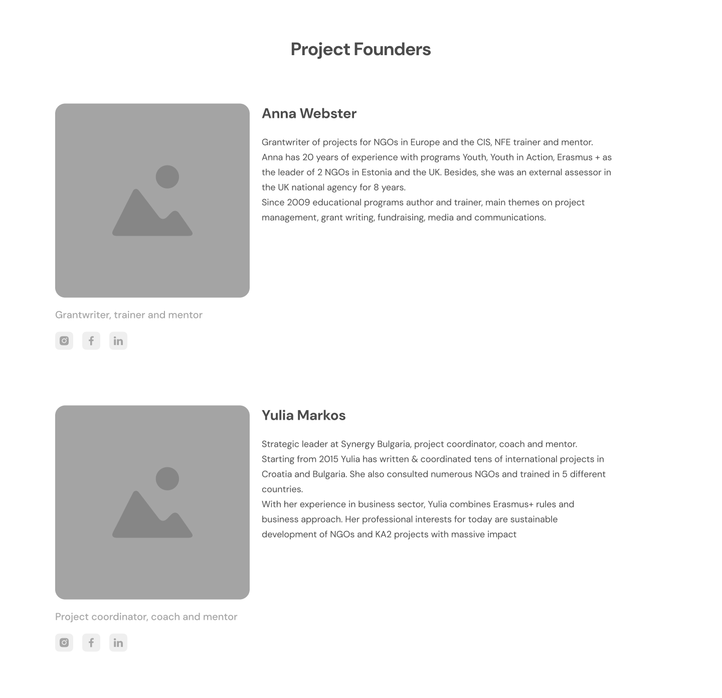
Project Founders Section
Key CTA Section
Branding & Visual Identity
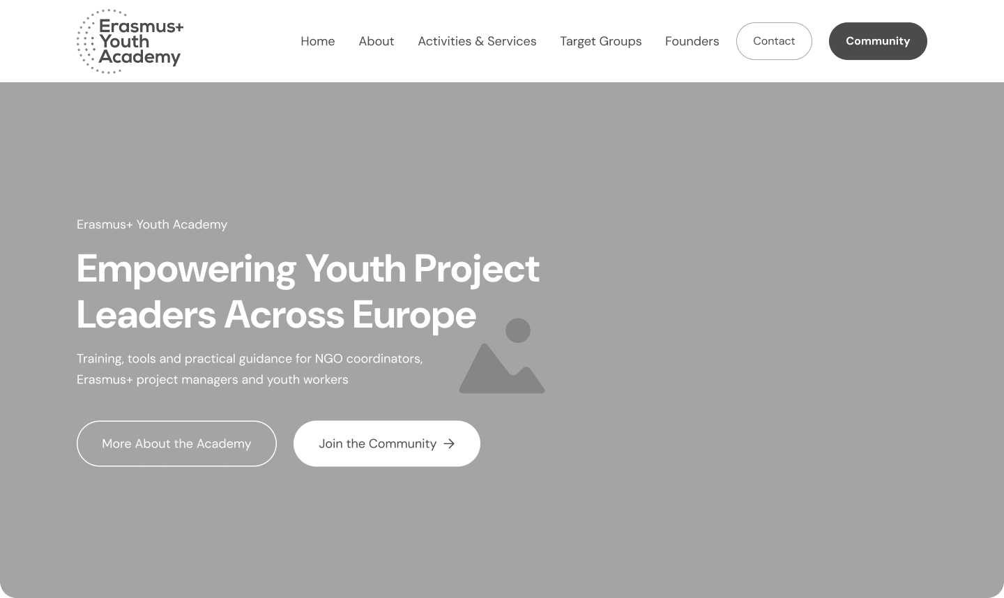
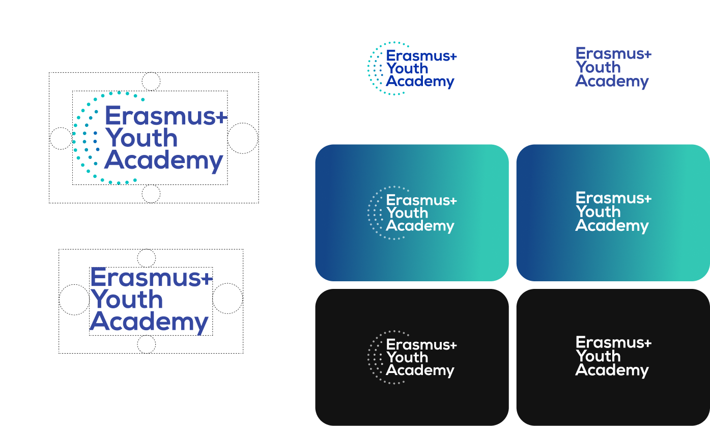
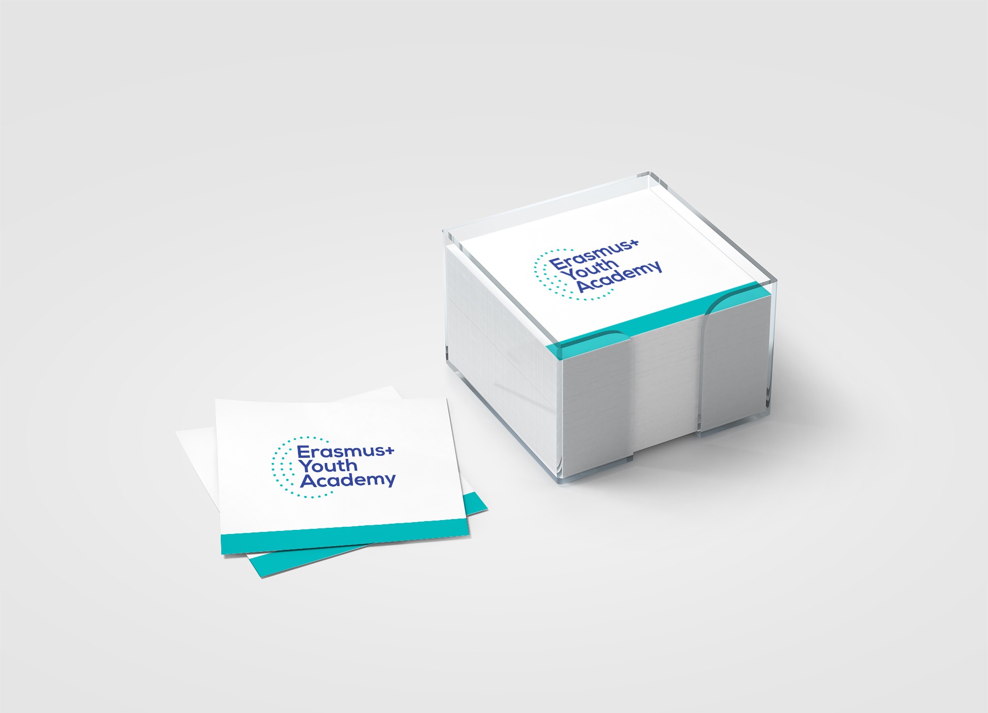
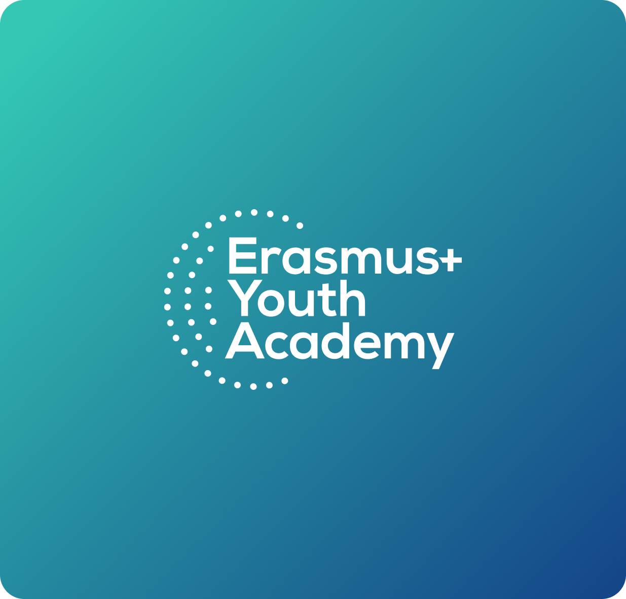
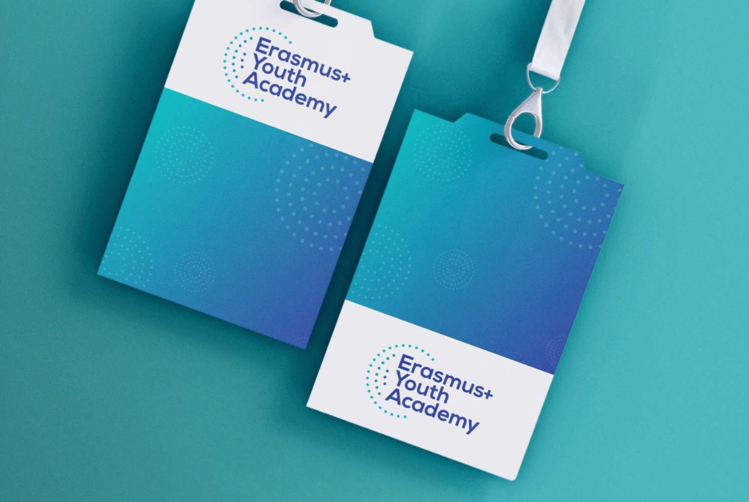
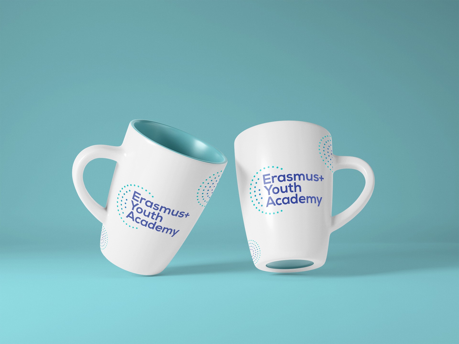
The logo combines a dotted circular motif symbolizing community, connections, and European collaboration and a bold, modern logotype using Manrope Bold
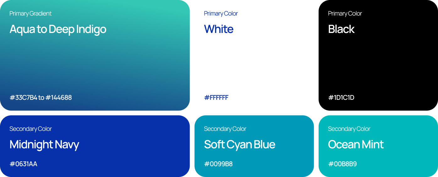
Colors were chosen to balance European institutional credibility and youth-friendly atmosphere
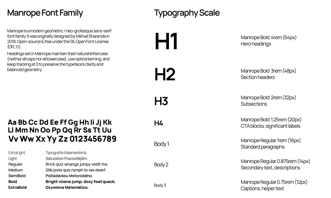
Typography is geometric, modern, accessible Manrope font family.
Logo Concept
Typography
Color System
Interaction Design
Subtle micro-interactions were implemented in Tilda Webbuilder, including parallax growth effects on background graphics and responsive interaction (hover) state on CTA buttons
Usability Improvements
A 15-minute usability session was completed with one NGO coordinator and one youth trainer to gather quick feedback
Confusion about target audience
→
Added “Who we support?” section
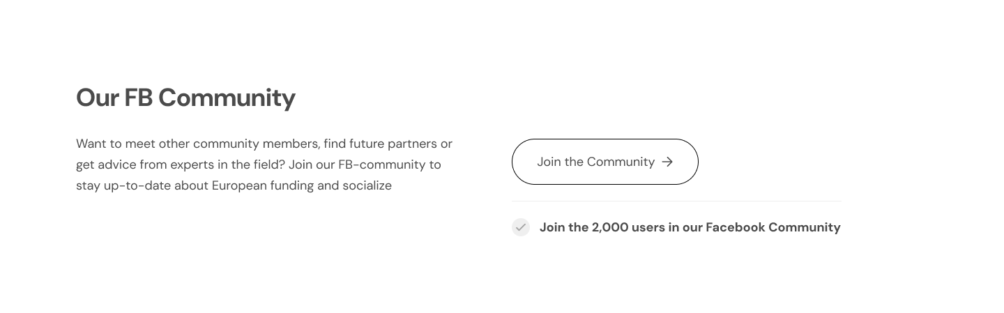
CTA “Join Now!” unclear
→
Improved CTA label to “Join the Academy”
Accessibility Check
→
WCAG-compliant color contrast
→
Accessible typography (min 16px)
→
Clear link and CTA styling and labeling
→
Logical heading hierarchy and IA
Impact & Results
→
Fully designed and developed landing page
→
Improved clarity of Erasmus+ Youth Academy offerings
The client highlighted increased interest from NGO partners and more target CTA Facebook Community members during program openings


Let’s discuss how my experience aligns with your team’s needs


Case Study
Erasmus+ Youth Academy
UX Design
UI Design
Interaction Design
Website Implementation (Webbuilder)
Brand Design
The Erasmus+ Youth Academy is an international educational initiative supporting NGO leaders, project managers, and youth workers involved in Erasmus+ and European Solidarity Corps programmes.The organization needed a modern, trustworthy, youth-oriented website that communicates clarity and professionalism while appealing to a young, international audience.
Year
2021-2022
Team
Solo designer
Scope
UX/UI DesignWebsite ImplementationInteraction DesignVisual Identity
Software
Miro
Adobe Illustrator
Adobe Photoshop
Adobe After Effects
Figma
Tilda Website Builder
Challenges Identified
01
No existing brand identity
The organization was new and had no visual language, logo, or design system
02
Need for clarity, trust, and motivation
Users should instantly understand the purpose and feel invited to join
03
Limited technical resources
The website needed to be built using Webbuilder, so designs had to work within constraints
Project Goal
Create and build a fully responsive website with interactions for a young audience
User Groups
Based on client workshops, discovery discussions, and an analysis of their existing target audience
01
NGO coordinators
Looking for tools, training, and application support.
02
Project managers
Need structured, reliable information and resources
03
Young trainers & youth workers
Prefer a simple, inspiring tone and visuals
Information Architecture
To minimize cognitive load for first-time visitors, the top-navigation was structured to be simple and focused
→
Home
→
About
→
Activities & Services
→
Target Groups
→
Founders
→
Contact
→
CTA
IA & Sitemap
UX Priorities
Scannability
Keep the homepage under 1 min scroll time
Mobile-First Design
Prioritizing layouts and interactions for mobile devices
Accessible Language
Ensure readability for non-native English speakers
Low-Fidelity Wireframes
Header & Hero Sections
Project Founders Section
Key CTA Section
Branding & Visual Identity
The logo combines a dotted circular motif symbolizing community, connections, and European collaboration and a bold, modern logotype using Manrope Bold
Colors were chosen to balance European institutional credibility and youth-friendly atmosphere
Typography is geometric, modern, accessible Manrope font family.
Logo Concept
Typography
Color System
Interaction Design
Subtle micro-interactions were implemented in Tilda Webbuilder, including parallax growth effects on background graphics and responsive interaction (hover) state on CTA buttons
Usability Improvements
A 15-minute usability session was completed with one NGO coordinator and one youth trainer to gather quick feedback
Confusion about target audience
→
Added “Who we support?” section
CTA “Join Now!” unclear
→
Improved CTA label to “Join the Academy”
Accessibility Check
→
WCAG-compliant color contrast
→
Accessible typography (min 16px)
→
Clear link and CTA styling and labeling
→
Logical heading hierarchy and IA
Impact & Results
→
Fully designed and developed landing page
→
Improved clarity of Erasmus+ Youth Academy offerings
The client highlighted increased interest from NGO partners and more target CTA Facebook Community members during program openings


Let’s discuss how my experience aligns with your team’s needs

Case Study
Erasmus+ Youth Academy
UX Design
UI Design
Interaction Design
Website Implementation (Webbuilder)
Brand Design
The Erasmus+ Youth Academy is an international educational initiative supporting NGO leaders, project managers, and youth workers involved in Erasmus+ and European Solidarity Corps programmes.The organization needed a modern, trustworthy, youth-oriented website that communicates clarity and professionalism while appealing to a young, international audience.
Year
2021-2022
Team
Solo designer
Scope
UX/UI DesignWebsite ImplementationInteraction DesignVisual Identity
Software
Miro
Adobe Illustrator
Adobe Photoshop
Adobe After Effects
Figma
Tilda Website Builder
Challenges Identified
01
No existing brand identity
The organization was new and had no visual language, logo, or design system
02
Need for clarity, trust, and motivation
Users should instantly understand the purpose and feel invited to join
03
Limited technical resources
The website needed to be built using Webbuilder, so designs had to work within constraints
Project Goal
Create and build a fully responsive website with interactions for a young audience
User Groups
Based on client workshops, discovery discussions, and an analysis of their existing target audience
01
NGO coordinators
Looking for tools, training, and application support.
02
Project managers
Need structured, reliable information and resources
03
Young trainers & youth workers
Prefer a simple, inspiring tone and visuals
Information Architecture
To minimize cognitive load for first-time visitors, the top-navigation was structured to be simple and focused
→
Home
→
About
→
Activities & Services
→
Target Groups
→
Founders
→
Contact
→
CTA
IA & Sitemap
UX Priorities
Scannability
Keep the homepage under 1 min scroll time
Mobile-First Design
Prioritizing layouts and interactions for mobile devices
Accessible Language
Ensure readability for non-native English speakers
Low-Fidelity Wireframes
Header & Hero Sections
Project Founders Section
Key CTA Section
Branding & Visual Identity
The logo combines a dotted circular motif symbolizing community, connections, and European collaboration and a bold, modern logotype using Manrope Bold
Colors were chosen to balance European institutional credibility and youth-friendly atmosphere
Typography is geometric, modern, accessible Manrope font family.
Logo Concept
Typography
Color System
Interaction Design
Subtle micro-interactions were implemented in Tilda Webbuilder, including parallax growth effects on background graphics and responsive interaction (hover) state on CTA buttons
Usability Improvements
A 15-minute usability session was completed with one NGO coordinator and one youth trainer to gather quick feedback
Confusion about target audience
→
Added “Who we support?” section
CTA “Join Now!” unclear
→
Improved CTA label to “Join the Academy”
Accessibility Check
→
WCAG-compliant color contrast
→
Accessible typography (min 16px)
→
Clear link and CTA styling and labeling
→
Logical heading hierarchy and IA
Results & Impact
→
Fully designed and developed landing page
→
Improved clarity of Erasmus+ Youth Academy offerings
The client highlighted increased interest from NGO partners and more target CTA Facebook Community members during program openings


Let’s discuss how my experience aligns with your team’s needs
